Tutorial
Main differences between matplotlib, seaborn, and plotly
Compare Python's top visualization libraries: Matplotlib, Seaborn, and Plotly. Learn when to use each library, their strengths, limitations, and best practices for different visualization needs.
Which Python libraries can you use for data visualization? In which cases do you use each of them?
Matplotlibfor highly customizable plots.Seabornfor automated plots based on Matplotlib.Plotlyfor interactive plots.
How do you import these libraries into the Python environment?
You must import a sub-library containing the main plotting functions for some of them.
import matplotlib.pyplot as plt
import seaborn as sns
import plotly.express as px
Enough theory! Let’s look at some examples using the same plot for each library.
Data
Using the famous gapminder dataset, we will plot data from countries in 2007.
import pandas as pd
df = pd.read_excel('gapminder.xlsx')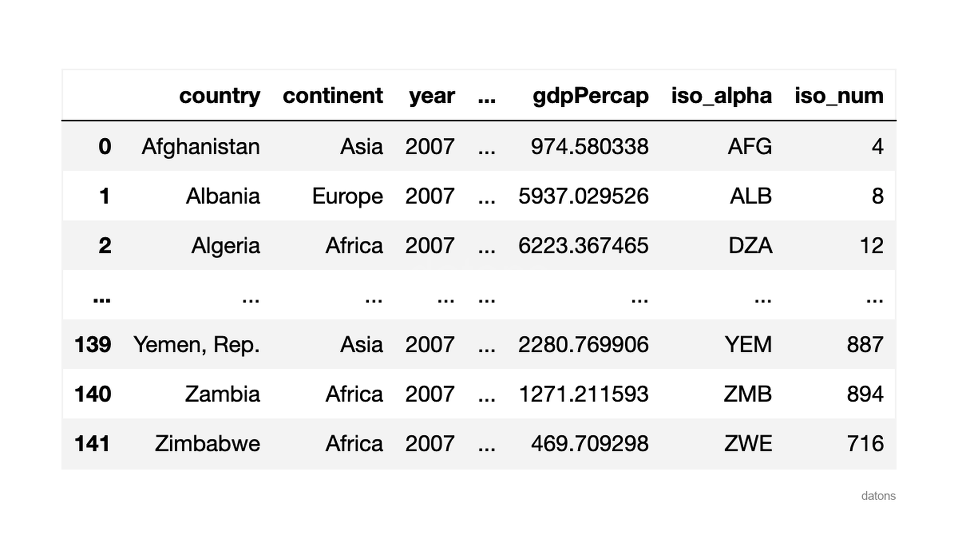
Scatter plot
Matplotlib
Matplotlib creates a simple scatter without labels on the axes.
plt.scatter(x='gdpPercap', y='lifeExp', data=df)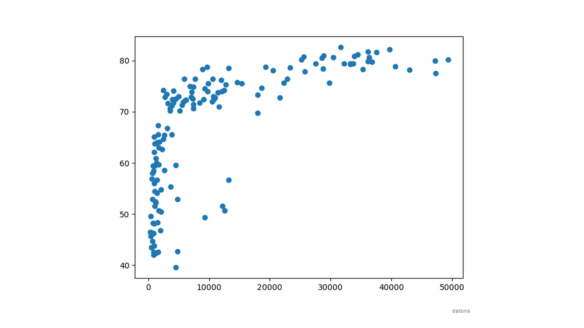
Seaborn
On the other hand, seaborn creates a scatter plot with labels on the axes. And even adds some borders to the points.
sns.scatterplot(x='gdpPercap', y='lifeExp', data=df)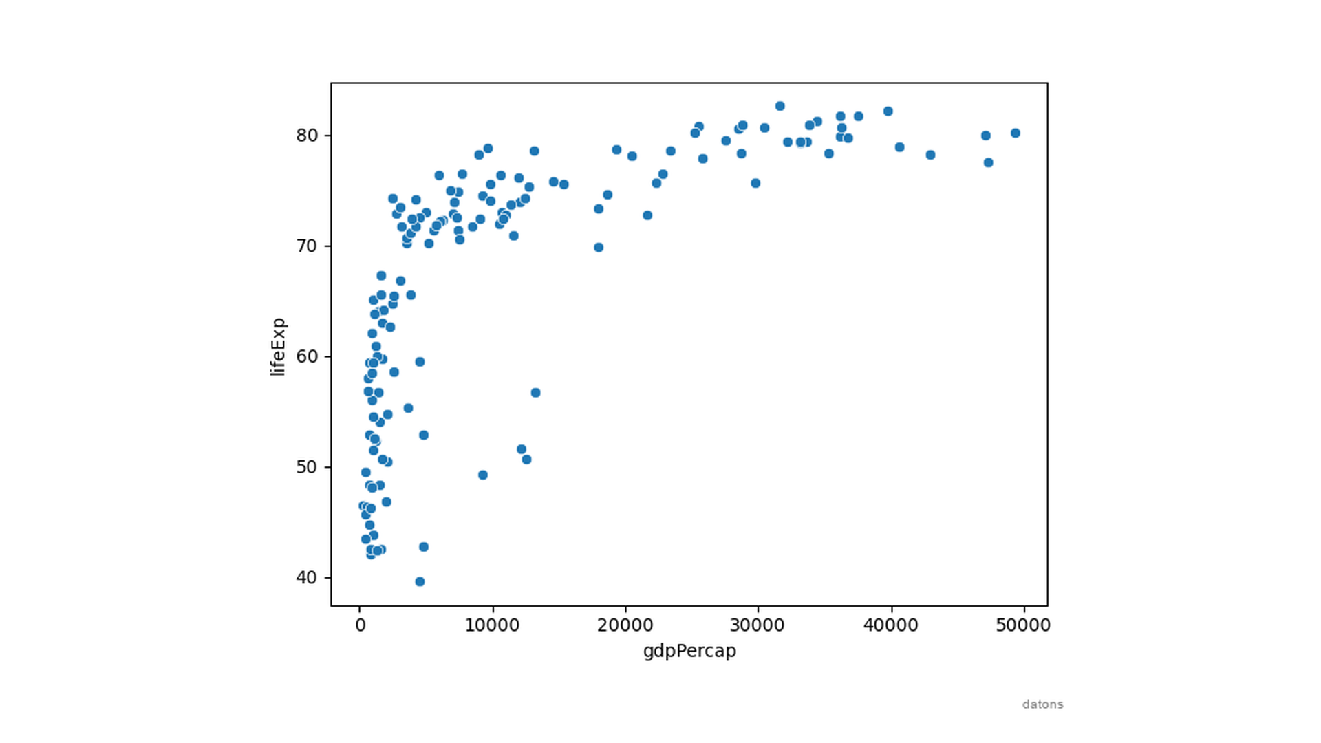
Now, what if you wanted to color the points by continent?
With matplotlib, you get a fatal error because it expects a column with names of colors, not a column with names of continents.
plt.scatter(x='gdpPercap', y='lifeExp', data=df, c='continent')

# ValueError: Invalid RGBA argument: 'Asia'
On the other hand, seaborn automates creating a scatter plot with a color-coded legend for the continent column, using the hue parameter.
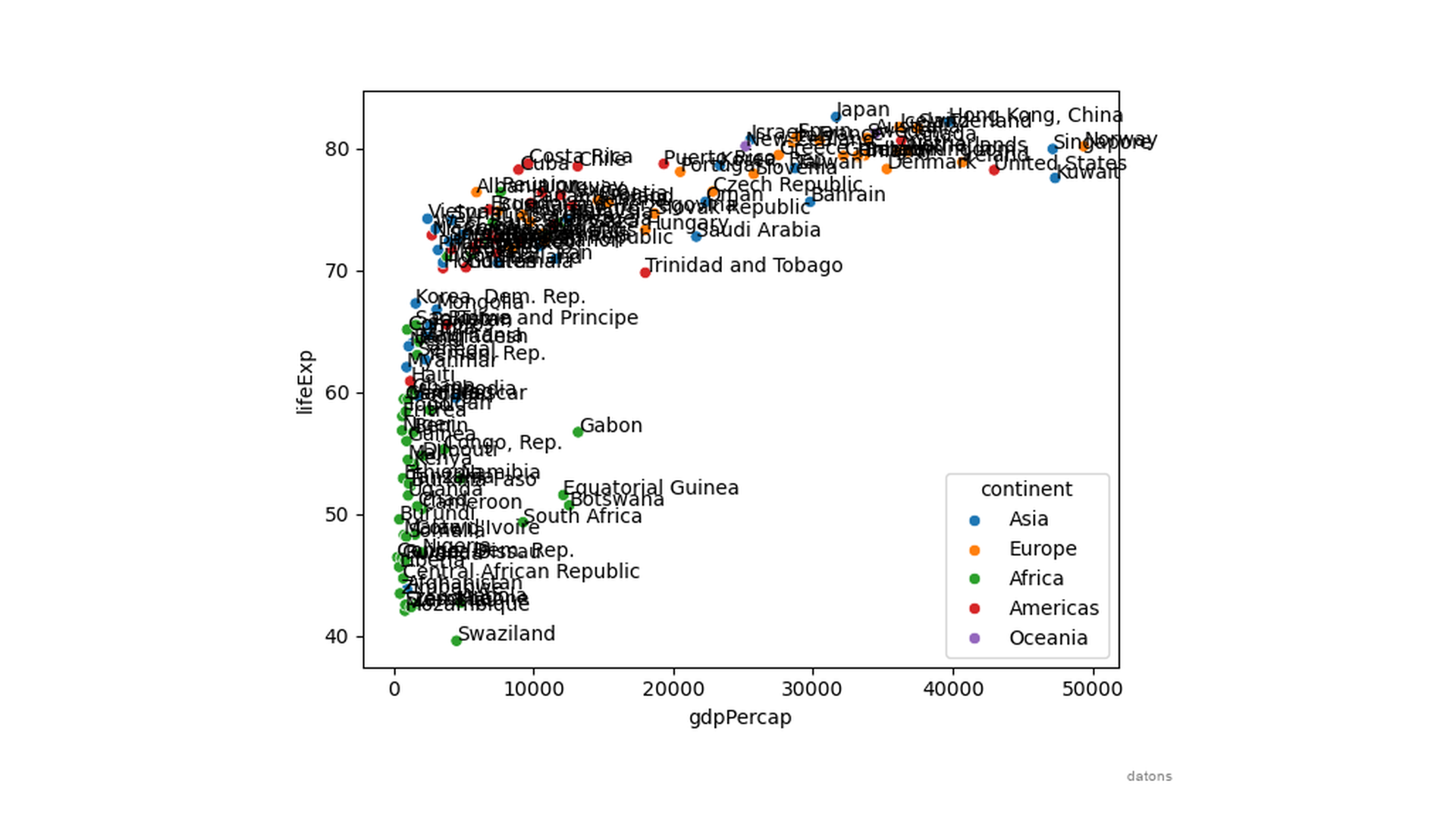
sns.scatterplot(x='gdpPercap', y='lifeExp', data=df, hue='continent')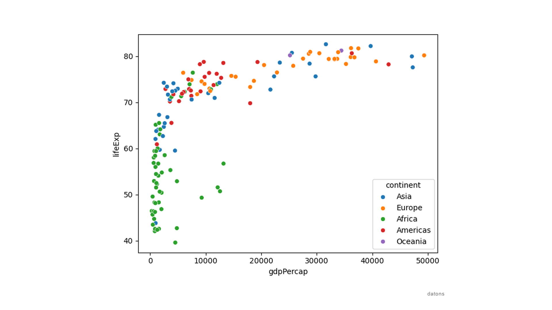
Now, how can you identify the country represented by each point?
This process is not automatic when using matplotlib, nor is it when using seaborn.
You’d need to create a horrible for loop to add the country names to the points, ending up with a cluttered plot.
sns.scatterplot(x='gdpPercap', y='lifeExp', data=df, hue='continent')

for idx, data in df.iterrows():
    plt.text(x=data['gdpPercap'], y=data['lifeExp'], s=data['country'])
Yes, you can combine seaborn with matplotlib to add new elements to the plot because seaborn is built on top of matplotlib.
Also, you can add new elements to the plot using matplotlib functions in a new line of code—for example, a title, labels, or a legend.
sns.scatterplot(x='gdpPercap', y='lifeExp', data=df, hue='continent')

for idx, data in df.iterrows():
    plt.text(x=data['gdpPercap'], y=data['lifeExp'], s=data['country'])

plt.title('Cluttered plot')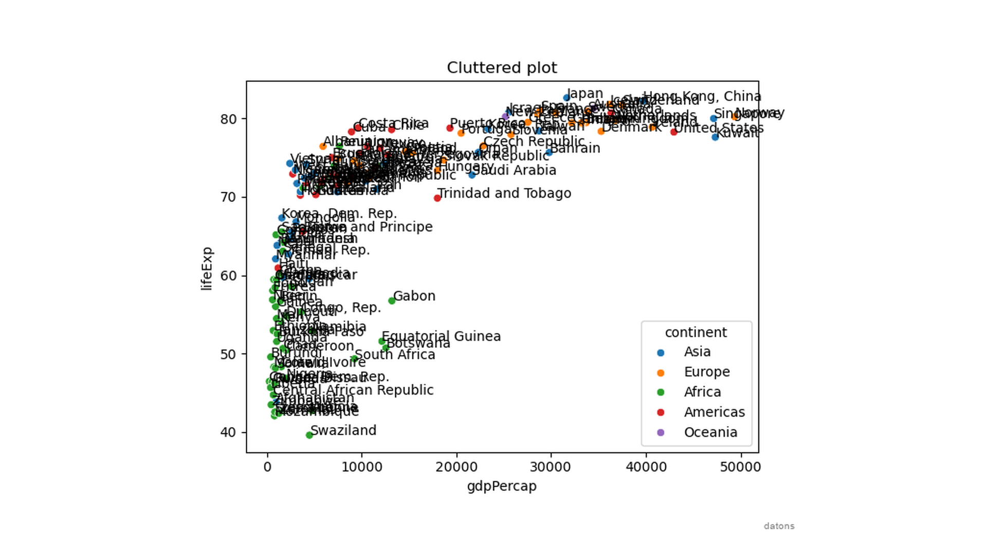
How can we declutter the mess of country names?
Plotly
Instead of adding the country names to the plot, you can hover over the points to see the country names.
px.scatter(df, x='gdpPercap', y='lifeExp', color='continent', hover_name='country')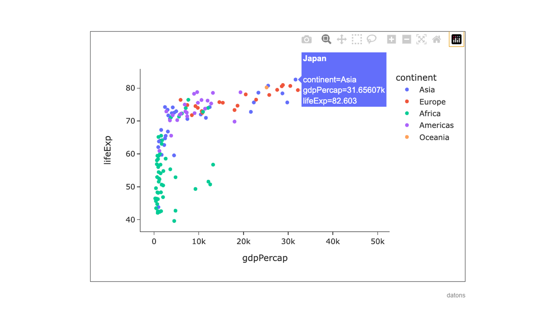
I love plotly because it’s interactive, and you can zoom in, zoom out, click on the legend to hide some countries, and even save the plot as an image.
But don’t get me wrong, plotly is not perfect.
If I wanted a highly customized plot, I’d use matplotlib because it’s more flexible, and you can control every plot detail.
These three libraries contain the necessary functions to create any other type of plot. Just choose the one that best suits your needs.
To learn more about these libraries, visit the official documentation:
Visit their examples gallery to see what you can do with them and replicate the plots in your projects with your data.
Conclusions
- If you are a beginner, use
plotlyfor simple plots. - If you are an intermediate user, use
seabornwithmatplotlibfor more complex plots. - If you are an advanced user, use
matplotlibfor highly customizable plots.